Components
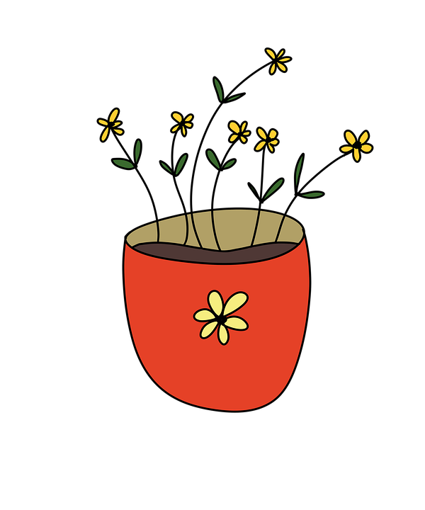
Content Heading
this is the body of content
 Getting Started
WebHelpUI is a powerful, feature-packed frontend Component Library. Just Think what you want to Build on your website and WebHelpUI Provides it in just a minutes.
Get started by including WenHelpUI production-ready CSS and JavaScript via CDN links without the need for any build steps.
index.html file in your project root. Include the
<meta name="viewport"> tag as well for proper responsive behavior in mobile
devices.
<!doctype html>
<html lang="en">
    <head>
        <meta charset="utf-8">
        <meta name="viewport" content="width=device-width, initial-scale=1">
        <tilte>WebHelpUI demo </tilte>
    </head>
    <body>
        <h1>Namaste 🙏, world!</h1>
    </body>
</html><link> tag in the
<head></head> for our CSS, and the
<script></script> tag for our JavaScript bundle before the closing
</body>
<!doctype html>
<html lang="en">
    <head>
        <meta charset="utf-8">
        <meta name="viewport" content="width=device-width, initial-scale=1">
        <title>WebHelpUI demo </title>
        <link href="https://webhelp-ui.netlify.app/css/webhelpui.use.css" rel="stylesheet" >
    </head>
    <body>
        <h1>Namaste 🙏, world!    </h1>
        <script src="https://webhelp-ui.netlify.app/js/webhelpui.use.js" >  </script>
    </body>
</html>To use all features of WebHelpUI, Just Add CDN Link of css in head tag and JavaScript at
the end of body tag of
index.html file. After adding CDN links Just search for your UI like navbar, button,
form etc in WebHelpUI components and Copy the HTML code given then add the code in your HTML file
where you want to add this UI.
<link rel="stylesheet" href="https://webhelp-ui.netlify.app/css/webhelpui.use.css">
<script src="https://webhelp-ui.netlify.app/js/webhelpui.use.js"></script>head tag and JavaScript at the end of body tag
<head>
    <meta charset="UTF-8">
    <meta http-equiv="X-UA-Compatible" content="IE=edge">
    <meta name="viewport" content="width=device-width, initial-scale=1.0">
    <link rel="stylesheet" href="https://webhelp-ui.netlify.app/css/webhelpui.use.css">
    <script src="https://webhelp-ui.netlify.app/js/webhelpui.use.js" ></script>
    <title>Button-Preview</title>
</head>
<body>

    <script src="https://webhelp-ui.netlify.app/js/webhelpui.use.js"></script>
</body><button id="btn-primary">Primary</button>
<button id="btn-secondary">Secondary</button>WebHelpUI supported in all Browsers and all devices.
A great way to create a responsive design, is to use a responsive style sheet, like
webhelpui.use.css.
WebHelpUI makes it easy to develop sites that look nice at any size!
All UI which you will use from WebHelpUI components is fully responsive and changes according to the screen size.
Let's Take an Exapmle of Navbar in Desktop and Mobile
We have devided all the devices into three categories based on their screen width.
width < 550px )550px < width < 800px ) width > 800px )Buttons are very important part of any website because buttons can link all the things and gives a good user experience.
WebHelpUI provides different categories of buttons, you can pick any of them according to your requirement
These buttons are build with button tag and anchor tag so you can add link
here also
<a href="#"><button class="btn btn-primary">Primary</button></a>
<a href="#"><button class="btn btn-secondary">Secondary</button></a>
<a href="#"><button class="btn btn-success">Success</button></a>
<a href="#"><button class="btn btn-danger">Danger</button></a>
<a href="#"><button class="btn btn-warning">Warning</button></a>
<a href="#"><button class="btn btn-info">Info</button></a>
<a href="#"><button class="btn btn-light">Light</button></a>
<a href="#"><button class="btn btn-dark">Dark</button></a>
<a href="#"><button class="btn btn-link">Link</button></a>These buttons are build with button tag and anchor tag so you can add link
here. If you not need to add link in button then you can just remove anchor tag.
<a href="#"><button class="btn btn-outlined-primary">Primary</button></a>
<a href="#"><button class="btn btn-outlined-secondary">Secondary</button></a>
<a href="#"><button class="btn btn-outlined-success">Success</button></a>
<a href="#"><button class="btn btn-outlined-danger">Danger</button></a>
<a href="#"><button class="btn btn-outlined-warning">Warning</button></a>
<a href="#"><button class="btn btn-outlined-info">Info</button></a>
<a href="#"><button class="btn btn-outlined-light">Light</button></a>
<a href="#"><button class="btn btn-outlined-dark">Dark</button></a>
<a href="#"><button class="btn btn-outlined-link">Link</button></a>Some of Tag buttons will work with form so you can use Submit, Reset button
to submit
the form or reset the
entered value in the form.
In the Link Button you can add Link of another page/url or any ID of your document to
redirect there.
<button type="submit" class="btn btn-tags">Button</button>
<input type="reset" class="btn btn-tags" value="Reset">
<input type="button" class="btn btn-tags" value="Input">
<input type="submit" class="btn btn-tags" value="Submit">
<a href="#" class="btn btn-primary">Link</a>
Profiles gives good User Experience on the website, it can be used to show user/admin profiles or logo in the Navbar.
WebHelpUI provides different types of Profiles based on the size and design, you can pick any of them according to your requirement.
Circular Profile can be used to show user profile or company logo. You can change the image also.
You can use this design by adding a class name
"crl-profile-box" and use any size by adding class names ".profile-lg",
"profile-mdl1","profile-mdl2","profile-sml1","profile-sml2".
You can also give custon size and style by using these class names using !important
keyword

<div class="crl-profile-box profile-lg">
    <img src="/Images/shiva-profile.jpg" alt="profile">
</div>

<div class="crl-profile-box profile-mdl1">
    <img src="/Images/shiva-profile.jpg" alt="profile">
</div>

<div class="crl-profile-box profile-mdl2">
    <img src="/Images/shiva-profile.jpg" alt="profile">
</div>

<div class="crl-profile-box profile-sml1">
    <img src="/Images/shiva-profile.jpg" alt="profile">
</div>

<div class="crl-profile-box profile-sml2">
    <img src="/Images/shiva-profile.jpg" alt="profile">
</div>
Squre Profile can be used to show user profile or company logo. You can change the image also.
You can use this design by adding a class name
"squre-profile-box" and use any size by adding class names ".profile-lg",
"profile-mdl1","profile-mdl2","profile-sml1","profile-sml2".
You can also give custon size and style by using these class names using !important
keyword
<div class="squre-profile-box profile-lg">
    <img src="/Images/shiva-profile.jpg" alt="profile">
</div>

<div class="squre-profile-box profile-mdl1">
    <img src="/Images/shiva-profile.jpg" alt="profile">
</div>

<div class="squre-profile-box profile-mdl2">
    <img src="/Images/shiva-profile.jpg" alt="profile">
</div>

<div class="squre-profile-box profile-sml1">
    <img src="/Images/shiva-profile.jpg" alt="profile">
</div>

<div class="squre-profile-box profile-sml2">
    <img src="/Images/shiva-profile.jpg" alt="profile">
</div>
Alerts are very important part of any website to show alerts show that user feels more connected and cannot face dificulties to use the website.
WebHelpUI provides different types of alerts based on the situation, you can pick any of them according to your requirement. These alerts are :
<div class="alert alert-primary">A simple primary alert—check it out! <span>X</span></div>
<div class="alert alert-secondary">A simple Secondary alert—check it out!<span>X</span></div>
<div class="alert alert-success">A simple Success alert—check it out!<span>X</span></div>
<div class="alert alert-danger">A simple danger alert—check it out!<span>X</span></div>
<div class="alert alert-warning">A simple warning alert—check it out!<span>X</span></div>Badge are used to show notification or status.
WebHelpUI provides different types of Badge based on the design, you can pick any of them according to your requirement. These alerts are :
It will show the status of Profile.
<div class="badge-profile badge-profile-1">
    <img src="/Images/shiva-profile.jpg" alt="logo">
</div>

<div class="badge-profile badge-profile-2">
    <img src="/Images/shiva-profile.jpg" alt="logo">
</div>

<div class="badge-profile badge-profile-3">
    <img src="/Images/shiva-profile.jpg" alt="logo">
</div>

<div class="badge-profile badge-profile-4">
    <img src="/Images/shiva-profile.jpg" alt="logo">
</div>

<div class="badge-profile badge-profile-5">
    <img src="/Images/shiva-profile.jpg" alt="logo">
</div>It will show the status of Heading on your website.
<div class="badge-heading badge-heading-1">
    <h1>Example Heading</h1>
</div>

<div class="badge-heading badge-heading-2">
    <h2>Example Heading</h2>
</div>

<div class="badge-heading badge-heading-3">
    <h3>Example Heading</h3>
</div>

<div class="badge-heading badge-heading-4">
    <h4>Example Heading</h4>
</div>

<div class="badge-heading badge-heading-5">
    <h5>Example Heading</h5>
</div>It will show the status of Link on your website.
<div class="badge-link badge-link-1">
    <a href="#">This is a new link</a>
</div>
<div class="badge-link badge-link-2">
    <a href="#">This is a new link</a>
</div>
<div class="badge-link badge-link-3">
    <a href="#">This is a new link</a>
</div>
<div class="badge-link badge-link-4">
    <a href="#">This is a new link</a>
</div>
<div class="badge-link badge-link-5">
    <a href="#">This is a new link</a>
</div>It will show the status of button on your website.
<button class="badge-button badge-button-1">
    Notification <span class="button-badge-text">6</span>
</button>It will show the status of Profile or Inbox on your website.
<button class="btn btn-info badge-positioned-1">
    Inbox <span class="positioned-badge-text">99+</span>
</button>

<button class="btn btn-info badge-positioned-2">
    Profile <span class="positioned-badge-text"></span>
</button>A card is a flexible and extensible content container. It includes options for headers and footers, a wide variety of content, contextual background colors, and powerful display options
WebHelpUI provides different types of Cards, you can pick any of them
according to your
requirement. Just Add CDN Link in your head tag and copy-paste the HTML code then you
will
get a card.
<div class="card-1">
    <div class="imgText">
        <div class="img">
            <img src="/Images/card-img-1.png" alt="image">
        </div>
        <div class="text">
            <h2>Content Heading</h1>
            <p>this is the body of content</p>
        </div>
    </div>
    <div class="below">
        <a href="#">READ</a>
        <a href="#">BOOKMARK</a>
        <span>🤍</span>
        <span><img class="card-1-icon" src="/Images/share-icon-card.svg" /></span>
        <span><img class="card-1-icon" src="/Images/vertical-three-dot.png" /></span>
    </div>
</div><div class="card-2">
<div class="img">
<img src="/Images/flower-card.jpg" alt="">
</div>
<div class="content">
<h2>Content Heading</h2>
<small>Sub Heading</small>
<p>This is the content paragraph.</p>
<span class="price">Rs. 999</span>
<span class="orgPrice">Rs.1099</span>
<span class="discount">10%</span>
</div>
<div class="card-2-btn"><a href="#"><img src="/Images/cart-card.svg" />Add to
cart</a href="#"></div>
</div>
<div class="card-3">
    <div class="img">
        <img src="/Images/image-card-3.jpg" alt="pic">
    </div>
    <div class="content">
        <h2>Content Heading</h2>
        <small>Sub Heading</small>
        <p>This is the content paragraph.</p>
    </div>
    <div class="card-3-btn"><a href="#">Go Somewhere</a href="#">
    </div>
</div>Build vertically collapsing accordions in combination with our Collapse JavaScript plugin. Accordians are used to show Q&A on the website.
WebHelpUI provides different types of Accordians with different style, you can pick any of them according to your requirement.
Click the accordions below to expand/collapse the accordion content.
Accordian Question - 1
Lorem ipsum dolor sit amet consectetur adipisicing elit. Cum earum animi id veniam repellendus corrupti distinctio explicabo velit eius molestias!
Accordian Question - 2
Lorem, ipsum dolor sit amet consectetur adipisicing elit. Excepturi itaque, quod illo eveniet quis eaque commodi. Aliquid tempore quidem et!
Accordian Question - 3
Lorem ipsum dolor, sit amet consectetur adipisicing elit. Necessitatibus repudiandae voluptas, laborum magni harum autem exercitationem ex odio modi numquam.
<div class="accordian">
    <p class="accordian-que">
        Accordian Question - 1
        <span><img src="https://webhelp-ui.netlify.app/Images/accordian-arrow.svg" alt=""></span>
    </p>
    <p class="accordian-ans">
        Lorem ipsum dolor sit amet consectetur adipisicing elit. Cum earum animi id veniam
        repellendus corrupti distinctio explicabo velit eius molestias!
    </p>
</div>
<div class="accordian">
    <p class="accordian-que">
        Accordian Question - 2
        <span><img src="https://webhelp-ui.netlify.app/Images/accordian-arrow.svg" alt=""></span>
    </p>
    <p class="accordian-ans">
        Lorem, ipsum dolor sit amet consectetur adipisicing elit. Excepturi itaque, quod illo
        eveniet quis eaque commodi. Aliquid tempore quidem et!
    </p>
</div>
<div class="accordian">
    <p class="accordian-que">
        Accordian Question - 3
        <span><img src="https://webhelp-ui.netlify.app/Images/accordian-arrow.svg" alt=""></span>
    </p>
    <p class="accordian-ans">
        Lorem ipsum dolor, sit amet consectetur adipisicing elit. Necessitatibus repudiandae
        voluptas, laborum magni harum autem exercitationem ex odio modi numquam.
    </p>
</div>
Loader activates when the page is loading and is shows a loading effect on website
WebHelpUI provides different types of Loader, You can use this by just adding CSS and
JS CDN
Link into your document.
Place the JavaScript Link at the end of body tag.

<div class="whi-loader">
    <img src="/Images/loader-5.gif" alt="">
</div>
<div class="whi-loader">
    <img src="/Images/loader-6.gif" alt="">
</div>
<div class="whi-loader">
    <img src="/Images/loader-7.gif" alt="">
</div>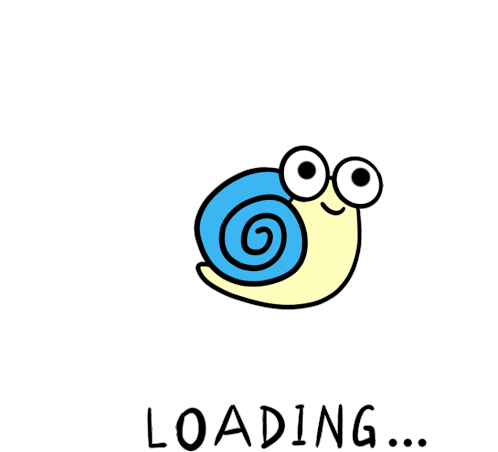
<div class="whi-loader">
    <img src="/Images/loader-3.gif" alt="">
</div>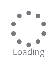
<div class="whi-loader">
    <img src="/Images/loader-4.gif" alt="">
</div>
<div class="whi-loader">
    <img src="/Images/loader.gif" alt="">
</div>
<div class="whi-loader">
    <img src="/Images/loader-2.gif" alt="">
</div>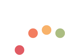
<div class="whi-loader">
    <img src="/Images/loader-8.gif" alt="">
</div>Form play an important role in terms of taking input from user. WebHelpUI provides form also you
can just add CDN link of CSS and copy-paste the below code into your document and you will get a
very responsive and awesome form in your website. You can change the width of the form using
form tag.
<form class="userform" action="">
    <input type="text" name="name" id="form-name" placeholder="Enter Your Name" required
        autocomplete="off">
    <input type="number" name="phone" id="form-phone" placeholder="Mobile No" required
        autocomplete="off">
    <input type="email" name="email" id="form-email" placeholder="Email ID" required
        autocomplete="off">
    <input type="password" name="password" id="form-password" placeholder="Enter Your Password"
        required autocomplete="off">
    <textarea name="address" id="form-address" cols="" rows="" placeholder="Enter Your Address.."
        required autocomplete="off"></textarea>
    <div class="radio-input">
        <input type="radio" name="gender" id="gender-male">
        <label for="gender-male">Male</label>
        <input type="radio" name="gender" id="gender-female">
        <label for="gender-female">Female</label>
        <input type="radio" name="gender" id="gender-other">
        <label for="gender-other">Other</label>
    </div>
<div class="buttons">
        <button type="submit">Submit</button>
        <button type="reset">Reset</button>
    </div>
</form>
Login Form is used to login for user account. WebHelpUI provides login form also you
can just add CDN link of CSS and JavaScript, copy-paste the below code
into your
document and you
will get a
very responsive and awesome Login form in your website. You can change the width of the form using
className.
<div class="login-container-1">
    <form action="">
        <h3>Log in</h3>
        <div class="inputBox">
            <span>Username</span>
            <div class="box">
                <div class="icon">
                    <img src="/Images/user-icon.svg" alt="">
                </div>
                <input type="text" placeholder="username">
            </div>
        </div>
        <div class="inputBox">
            <span>Password</span>
            <div class="box">
                <div class="icon">
                    <img src="/Images/lock-closed-icon.svg" alt="">
                </div>
                <input type="password" placeholder="password">
            </div>
        </div>
        <label for="">
            <input type="checkbox" name="" id=""> Remember me
        </label>
        <div class="inputBox">
            <div class="box">
                <input type="submit" value="Log in">
            </div>
        </div>
        <div class="forget-pass">
            <a href="#" class="forgot">Forget Password</a>
        </div>
    </form>
</div><form action="" class="login-container">
<h3>Login Panel</h3>
<input id="userName" type="text" placeholder="user name" required autocomplete="off">
<input id="password" type="password" placeholder="Password" required>
<button type="submit">Submit</button>
<div class="result"></div>
<p>⭐ Length of Password Should be atleast 8</p>
</form>This component can be used for toast or snackbar component. Snackbar is to used show message that need user action
You can use snackbar to show notifications and error,sucess and warn messages.
WebHelpUI provides different types of snackbars based on the situation, you can pick any of them according to your requirement.
<!-- Success SnackBar  -->
<button class="success-warn-btn">Success</button>
<div class="success-snackbar-warning">
    Completed Successfully
</div>

<!-- Error SnackBar  -->
<button class="error-warn-btn">Error</button>
<div class="error-snackbar-warning">
    Error 404
</div>

<!-- Warning SnackBar  -->
<button class="warning-warn-btn">Warning</button>
<div class="warning-snackbar-warning">
    Warning! Accessing Wrong File
</div>
Footer is displaying at the bottom of page.
WebHelpUI provides Footer, You can Use it by just paste the HTML, code and add CDN link of
CSS
<footer>
    <img src="" alt="Your-logo">
    <p>© 2022 | Company-Name | All rights reserved.</p>
</footer>


 Add to
cart
Add to
cart